1 min read
Booking Boss: the category that sets a SaaS apart
After raising $2 million in Series A funding, Booking Boss had everything they needed for international expansion - except one thing. They couldn't...

1 min read
After raising $2 million in Series A funding, Booking Boss had everything they needed for international expansion - except one thing. They couldn't...

1 min read
When your existing brand can't contain what your business has become, growth stalls - not because the product isn't ready, but because the market...

1 min read
Having the capability to compete at a higher level and being recognised for it are two very different problems. Arborcraft had solved the first one....

1 min read
A strong business with a weak brand isn't a creative problem. It's a positioning problem. Formline had built 25 years of genuine capability and...

1 min read
When a global brand asks you to create something that's never been done before, an entirely new sub-brand developed outside its home market, the...
1 min read
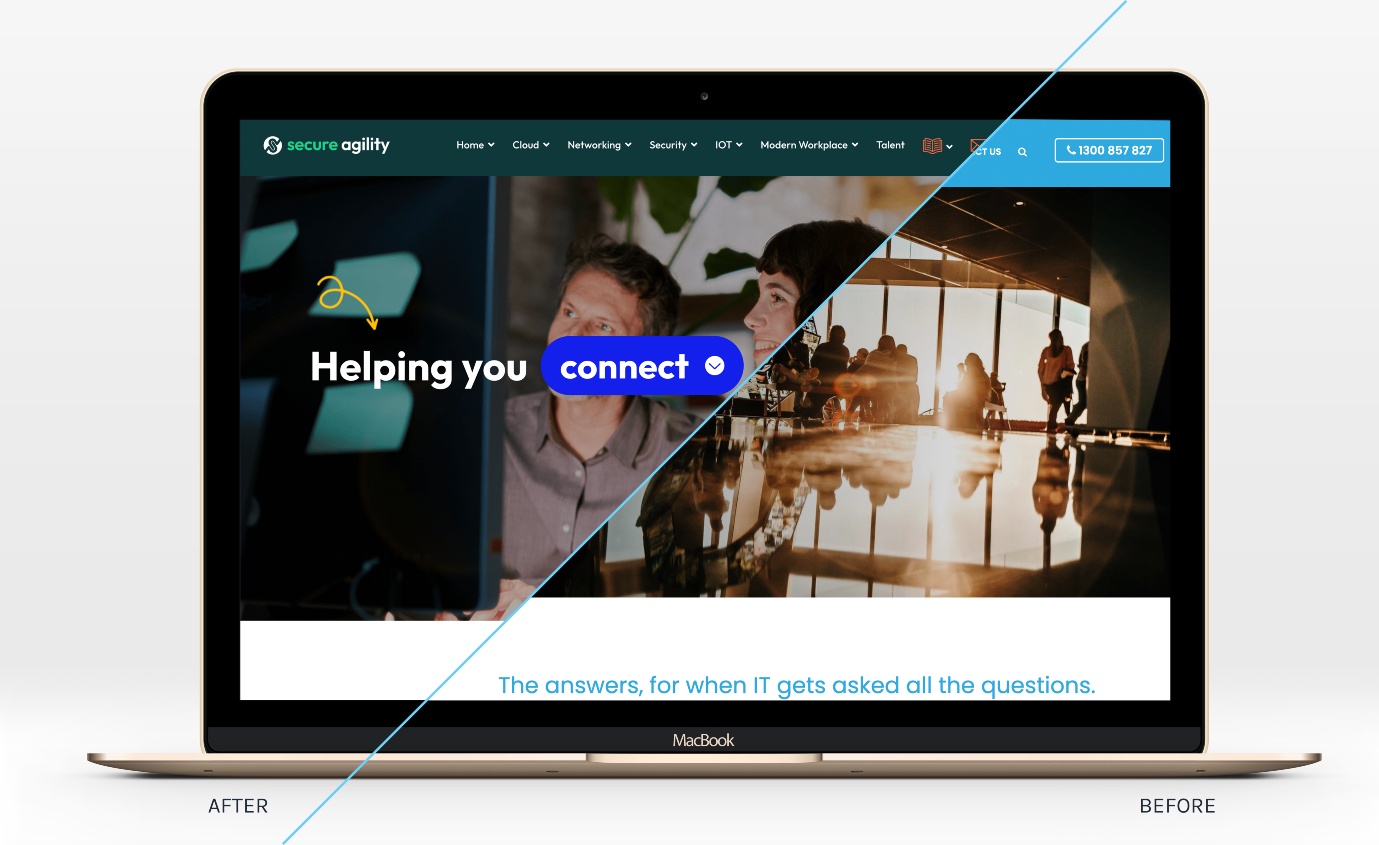
When a business evolves significantly but its brand doesn't, there's a gap. Prospects see the old version. Clients know the new one. Secure Agility...
.jpg?width=1200&height=628&name=MoleMap%20hero%20image%20-%20clinic%20door%20entrance%20(1200%20x%20628%20px).jpg)
1 min read
A strong value proposition and a growth ceiling aren't contradictory. MoleMap's corporate division had both. The product was proven. The sales...

1 min read
The strongest industrial brands aren't built on what a company does. They're built on how a company thinks. SAGE Automation had the thinking. They...