


Software companies all over the world have a specific challenge. It is one that we see them consistently struggle with – and no wonder. It is not an easy job.
Creating effective b2b product pages that generate qualified leads while accurately showcasing complex solutions requires both technical expertise and marketing finesse. Yet many software companies struggle to strike this balance effectively.
Marketing high-tech products is a tricky business. Not only do customers face a multitude of adoption quandaries, but investing in a new technology, dealing with switching costs, choosing between alternatives and/or investing in a completely new technology is actually quite a daunting prospect. To add to this pressure, the cost of choosing the wrong technology is high – both in the financial sense, as well as the workload involved for the relevant staff.
All of this results in high levels of uncertainty about software choices – uncertainty that we, as software marketers, need to allay.
Modern b2b buyers approach product pages with heightened scrutiny and risk awareness compared to b2c consumers. Your b2b product pages must not only showcase features but also address implementation concerns, ROI potential, and compatibility with existing systems.
Did you know that 92.6% of people feel that visuals are the top influential factor affecting a purchase decision? Studies have shown that first impressions are 94% design-related.
So it stands to reason that one of the first things we must do is to ensure that our b2b product pages are looking schmick.
Good looks alone won't save your b2b product pages
Of course, good looks alone will win you no awards. Your b2b product pages need to both look beautiful and work beautifully – in equal measure, in order to attract, engage and convert your ideal customer.
Does this sound scarier than a whole lot of snakes on a plane? It's not as bad as it sounds.
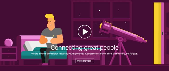
1. Strategic visual storytelling that addresses pain points
Visual storytelling is a way of grabbing your customer’s attention when they are experiencing your product online. For b2b product pages, explainer videos that address specific industry challenges are particularly effective.
Here are just some of our faves for reference: Spotify, GigTown, Olark, Next Glass, Munzit, PandaDoc, Autosoft FLEX Connect, and VeriFi.
You’ll notice that all of them acknowledge the customer’s dilemma and take them on a journey in order to solve it.
They reveal just how great the future might be once this problem is solved. The storylines use emotion and relatability to resonate with the viewer, helping them to build trust with strangers and to humanise their story.
Effective b2b product pages use visual storytelling that speaks directly to the decisio-makers challenges while demonstrating measurable business outcomes and implementation success stories.
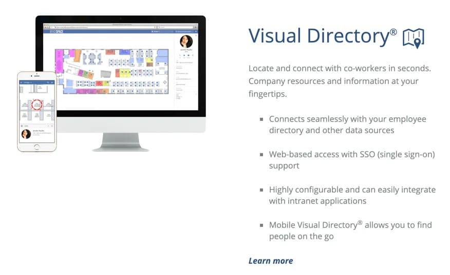
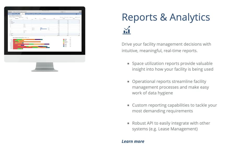
2.Interface demonstrations that build confidence in usability
It isn't easy to judge digital products until you’ve actually used them. In the absence of that, demonstrating how your product works to your customer is a seemingly obvious, yet often missed opportunity for software marketers.
Showing the interface of your software is as close as you can get to highlighting your product’s usability. A couple of carefully-chosen screenshots shown in context will give your audience a feel for your software’s intuitive design.
B2b buyers need to visualise how your solution will integrate into their existing workflows. The most successful b2b product pages showcase realistic interface examples that highlight ease of implementation and minimal disruption to operations.
Below are some examples of software images from OfficeSpace that accurately demonstrate their products in detailed screen views. Both give you a fantastic idea of what to expect.
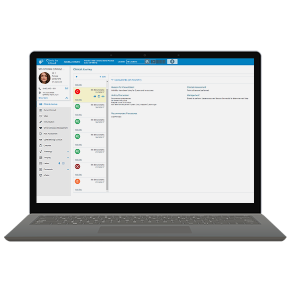
3. Feature presentation optimised for b2b decision-making
Display the main solutions your product can offer. A great way to help explain your features is by marrying them with icons or illustrations to visually explain the point. Clinic to Cloud uses some amazing animated illustrations to highlight top features to engage the user.
When designing b2b product pages, organise features by business function or department to help stakeholders quickly identify relevant benefits. Technical decision makers and executive sponsors often evaluate different aspects of the same solution.
4. Risk-reduction elements that address adoption concerns
Allow people to try your software so they can begin learning the ins and outs. Once they have a taste of the inner workings and see upfront how beneficial it is to their business, you are one step closer to converting them.
Allowing your customers to try before they buy builds trust in you as a vendor. The fact that you are putting your product where your mouth is speaks volumes.
For enterprise software, successful b2b product pages offer multiple risk-reduction options beyond standard trials, including personalised demos, sandbox environments, and implementation consultations. Each represents a valuable conversion point on your product page.
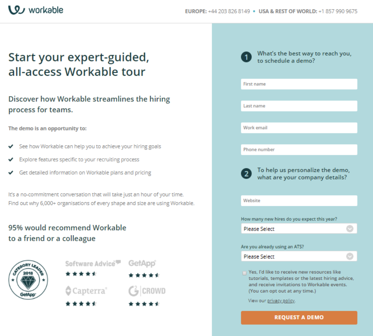
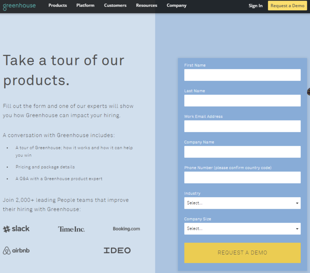
The below examples of Workable and Greenhouse show some engaging, clean and simple sign-up forms that users can fill out in order to receive a free trial. These businesses show how you can make more functional pages of your site just as visually sensational as any other page – and seduce your potential buyer in the process.
5. Use white space and clean design
Keep your pages simple and focused on the product. A simple-looking interface will be much more enticing for your user to scan. It’s also scientifically proven that websites that are crammed full of information are harder for the human eye to read and therefore, people are more likely to abandon ship sooner.
For b2b product pages, clean design is even more critical given the complexity of the offerings. Use progressive disclosure techniques to layer information, allowing visitors to dig deeper into specific aspects without overwhelming initial impressions.
Research has shown that the images you are surrounded with can directly affect your attitude about a subject. Use images that convey a strong emotional feeling and have a role to play in sending the right message to your audience.

Measuring your b2b product page performance
To optimise your b2b product pages effectively, establish clear performance metrics aligned with your sales funnel:
- Page engagement metrics (time on page, scroll depth)
- Feature interaction tracking
- Demo/trial request conversion rates
- Document download rates
- Section-specific heat mapping
- Return visitor behaviour patterns
Regularly comparing these metrics against your sales cycle data will help you refine your b2b product pages for maximum effectiveness. The most successful b2b companies treat their product pages as continually evolving assets rather than static destinations.
Final words
When it comes to explaining how your software works to a potential buyer, your visual approach speaks volumes. Think beautiful and functional. We hope that these examples and design tips can help you create b2b product pages that not only impress visitors visually but also guide them smoothly through your complex solution offering.

Brand chemistry is a b2b web design agency that engineers visually stunning, high-conversion websites. We craft digital experiences that resonate and convert, ensuring your online presence stands out.